Mobile App Product Design & No-Code Development
Seen

View Case Study

YEAR
ROLE
Company
As the Lead Product Designer at Omaisha, I spearheaded the creation of a transformative platform aimed at revolutionizing mental healthcare for workers. Omaisha addresses the critical gap in assessing and improving employees' mental wellbeing within organizations. This comprehensive case study explores the design journey from inception to execution, highlighting key design phases and the impact on employee mental health.
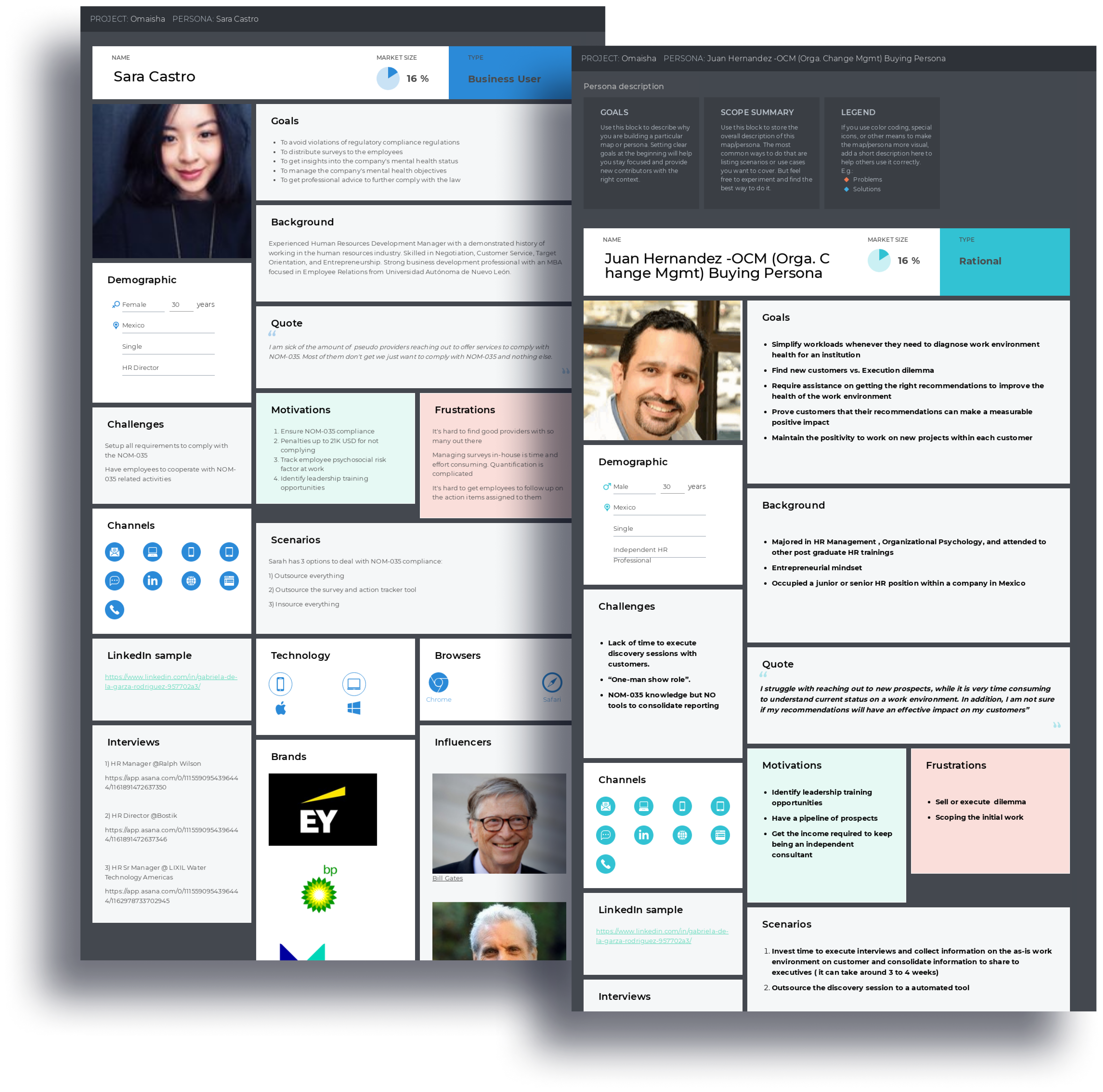
Based on the interviews made in collaboration with the Product Team I set up two personas.
The interview questions were translated by the Operations team and presented to targeted users on online forms.
We referred to them throughout the entire product design process.
The main pain points that we found was that the users found it hard to add an extra platform in their workflow because of the learning curve and workload it will add.
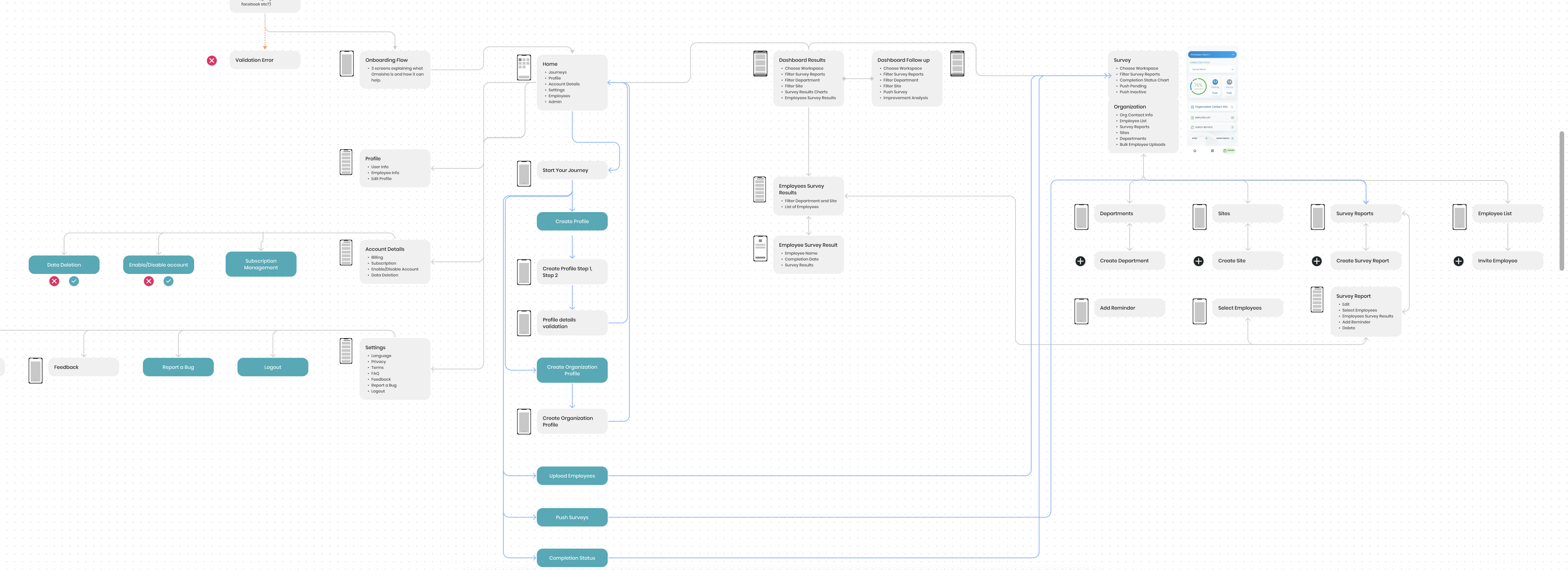
User Journey Mapping: Mapping the user journey was a strategic exercise to identify pain points and opportunities. From the HR manager initiating a mental wellness survey to the employee receiving tailored recommendations, the user journey clarified touchpoints and interactions.
In order to align user's goals with our product we needed a clear goal achieved following a enjoyable and easy journey.
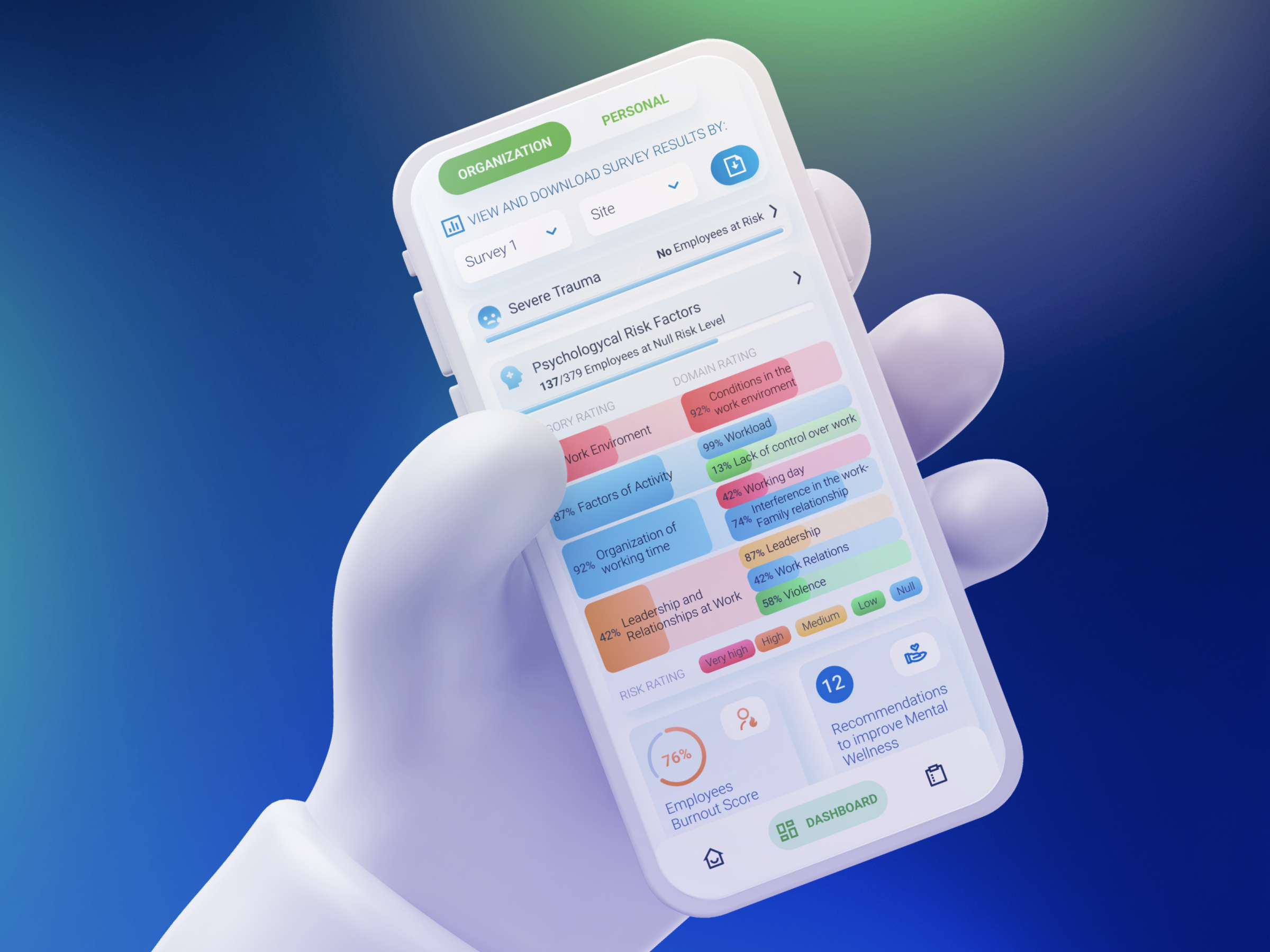
The most important user goal was mapped with our product mission as guidance, to measure and improve employees mental wellbeing risk levels trough charts, reports and recommendations.
To have a journey easy to understand and follow by the user, I determined that the Personal and Organization Profiles will be created in 2 easy steps that will take to the Onboarding carousel explaining the user the following three actions needed to achieve the goal.
For the user to remain calm and feeling in control of the platform all the time, I created a Journey Guiding feature located on the Home Screen for easy access. The moment users sign up, from the Journey the platform can be quickly learned with step-by-step explanation and required call-to-action.
Since the user needed a easy, hassle-free process, I continued to apply the principle of three steps by having three main navigation tabs from where the user will perform the three steps to achieve the goal.
From Home tab the user access payment options, profile details and starts the Guided Journey that takes him to the Survey tab where Organization and Employees details can be edited and Surveys can be sent. The Results and Recommendations progress can be checked from Dashboard trough Charts and Reports.
This Journey Mapping helped me empathise with the user, allowing me to iterate the journey multiple times to find the easiest flow for them, and making a huge impact in the final usability of the product.
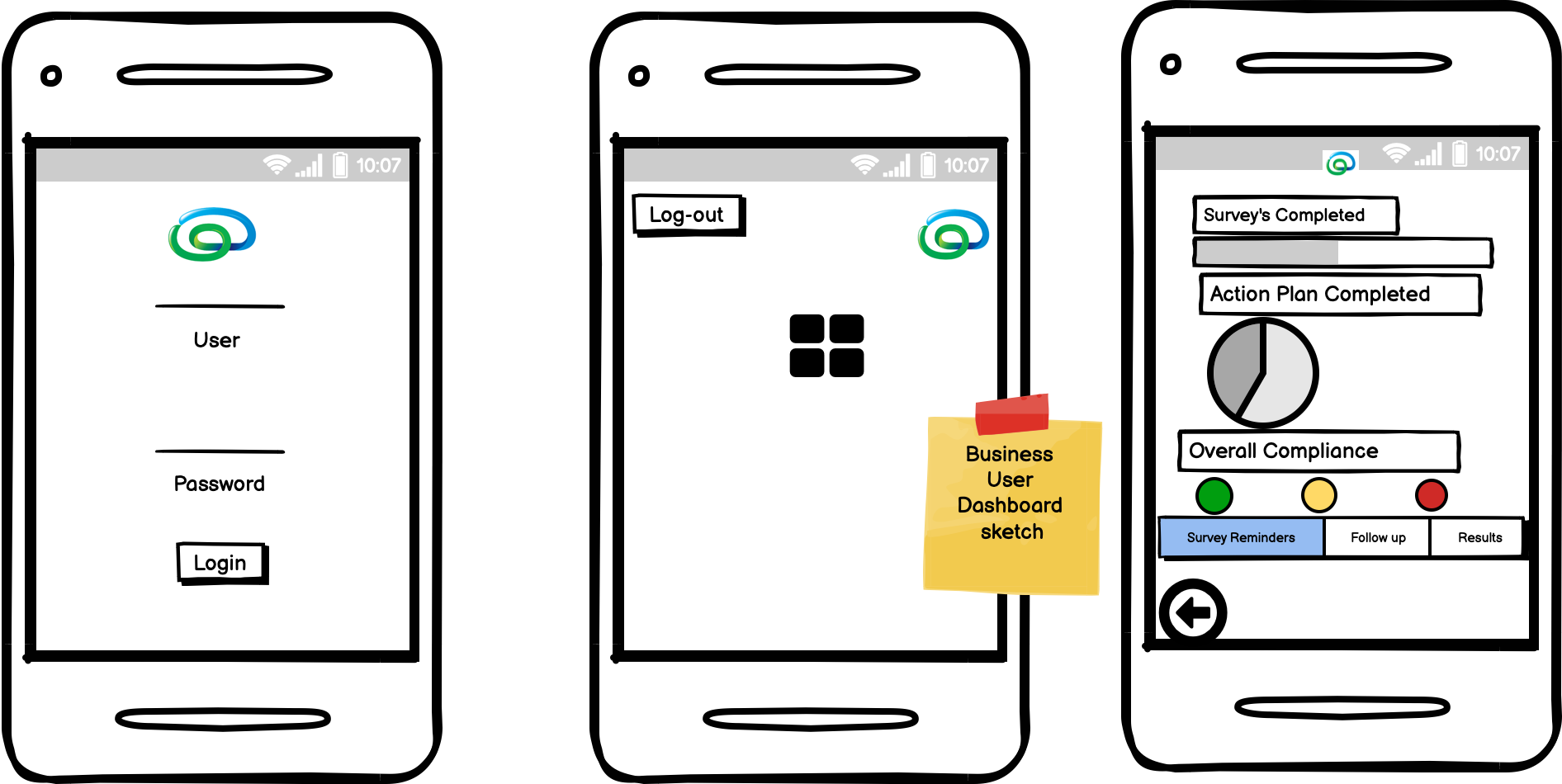
Low-Fidelity Wireframes: The design process commenced with low-fidelity wireframes, translating ideas into skeletal representations. These wireframes facilitated early exploration of layout and functionality, allowing for rapid iteration and feedback.
In live collaboration with the Product Management Team, I mapped the features in Low Fidelity inside the Balsamiq app to set a starting point and ensure the designs aligned with the product vision.Having the pages elements and features confirmed early in a single meeting allowed me to understand better the product and the challenges I would face designing the solutions, after all the pages were decided, I quickly started to work on the High Fidelity Designs
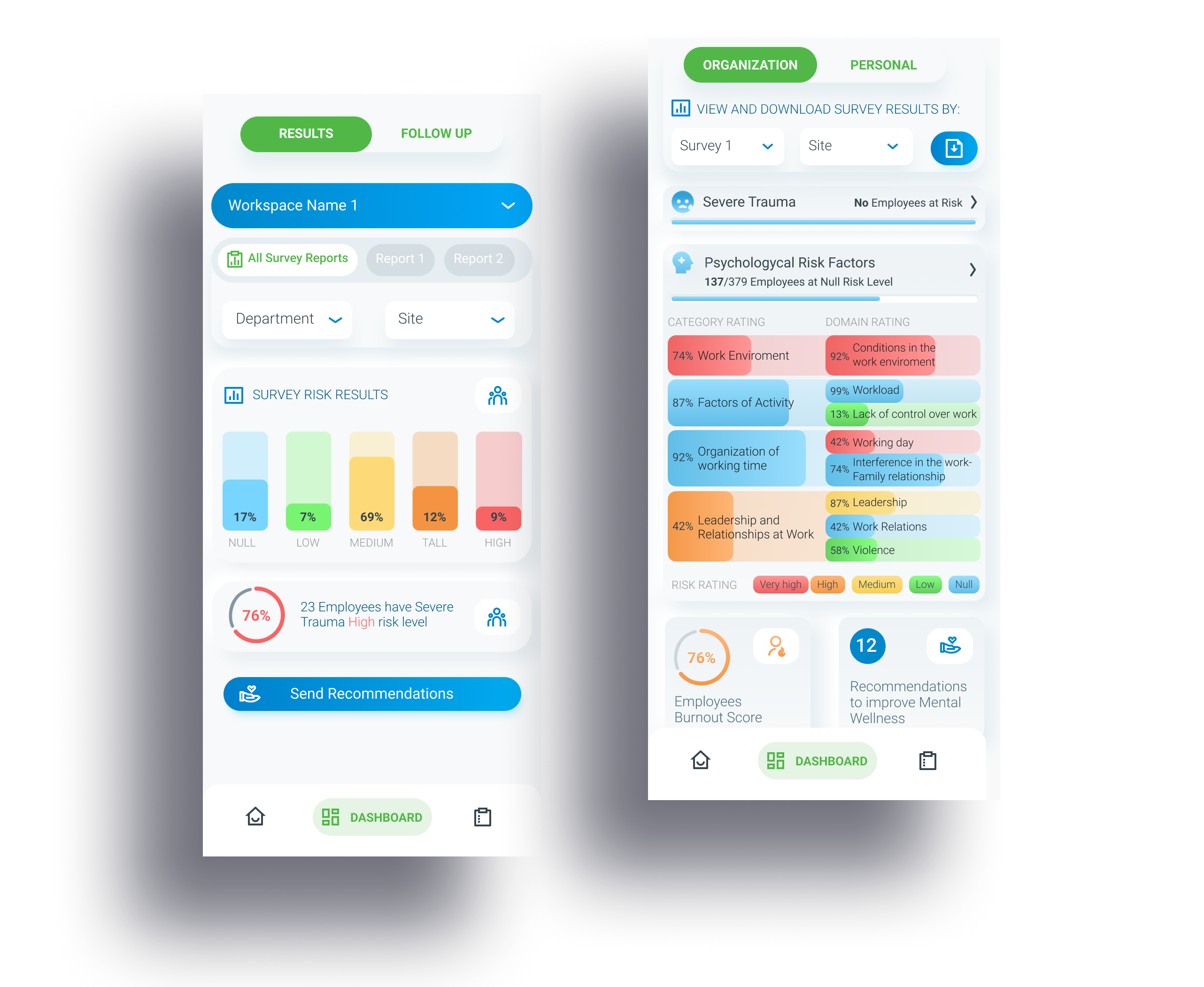
High-Fidelity Wireframes: As concepts solidified, high-fidelity wireframes brought depth and visual coherence. These wireframes showcased the refined interface, ensuring alignment with the intended user experience.
I created high-fidelity wireframes in Figma for internal testing and feedback from stakeholders, the Product, and the Development team.
By designing a high-fidelity interface directly from the existing Balsamiq Low Fidelity I could make sure UI Elements correctly represent UX Principles, avoiding extra time correcting and implementing manual sketches to low-fidelity, then designing again for high-fidelity design.
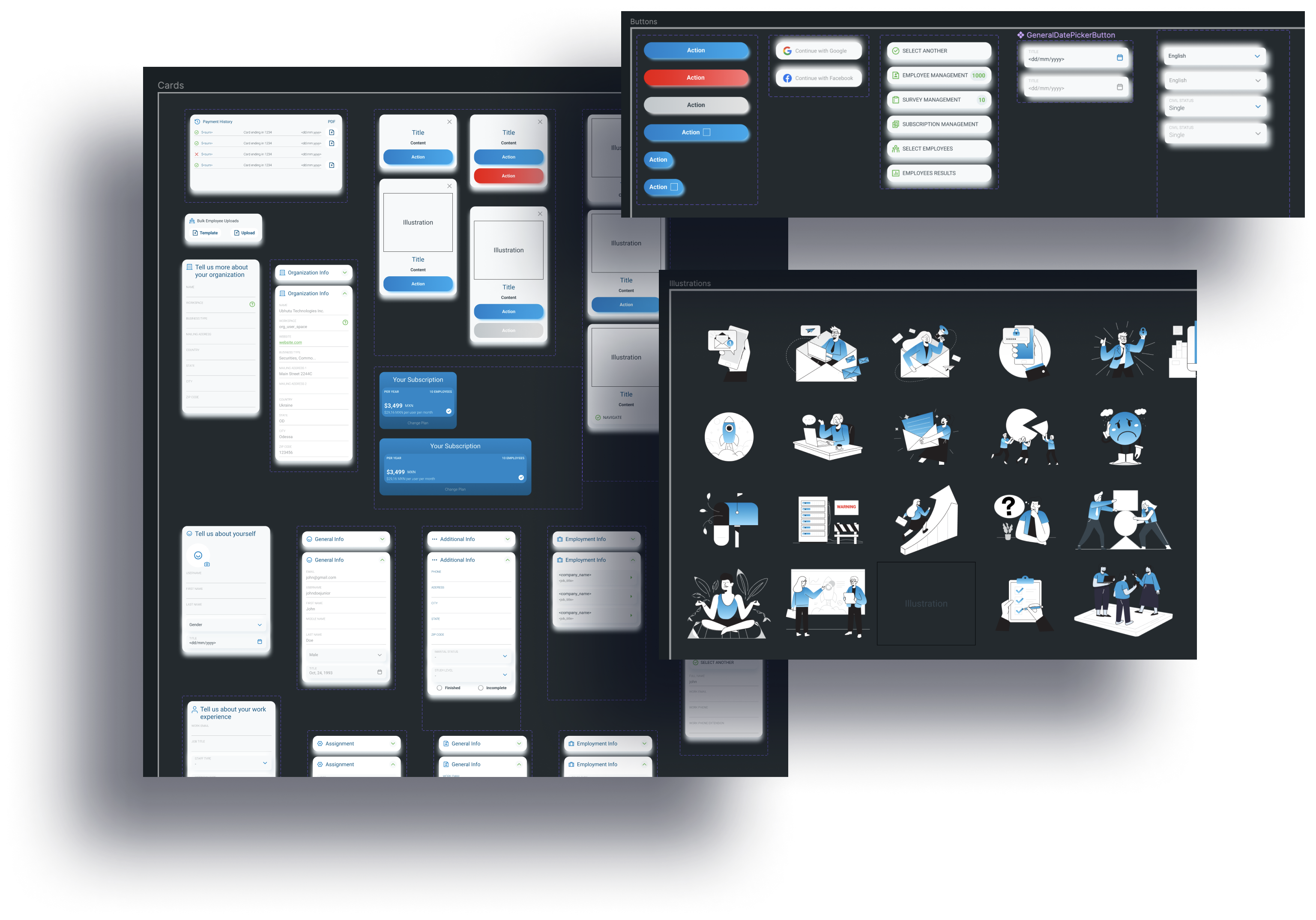
During the wireframing, I started creating the Atomic Design System Components that served as a base for all the Design.
Iteration Ideas: Continuous refinement was at the core of the design process. Iteration ideas ranged from optimizing survey flows to enhancing recommendation algorithms, ensuring that Omaisha evolved based on user feedback and industry best practices.
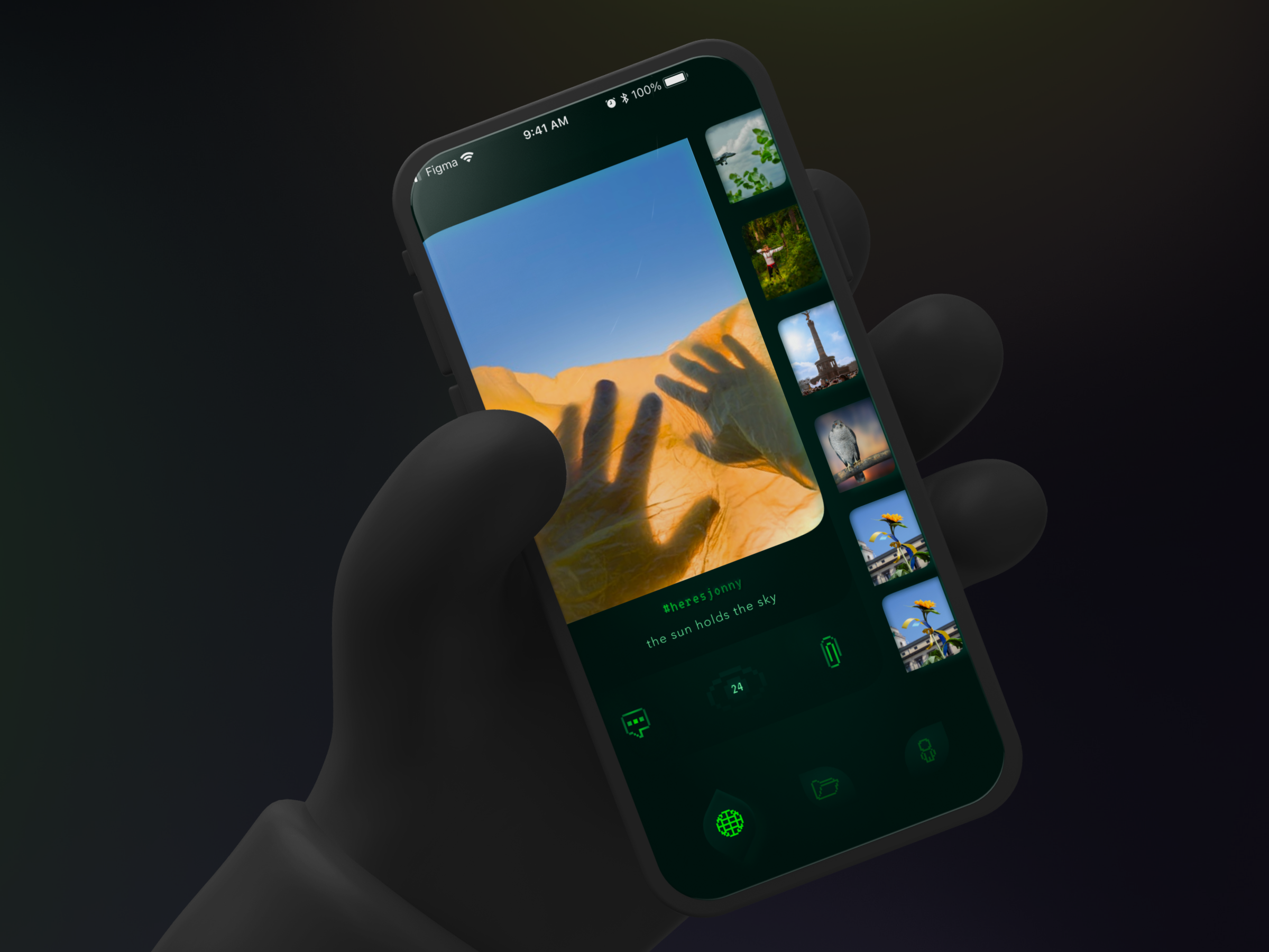
While quickly iterating the high fidelity wire framing, one of the best ideas that came trough was to design a custom chart for the dashboard so the user ca easily understand the complex information in a glance, since the standard chart methods would take very long space and time to be red. It turned out to be a major feature of the product that the users used to get an preview of the mental status both on the B2B and B2C sides of the platform, and also in the printable reports of the company.
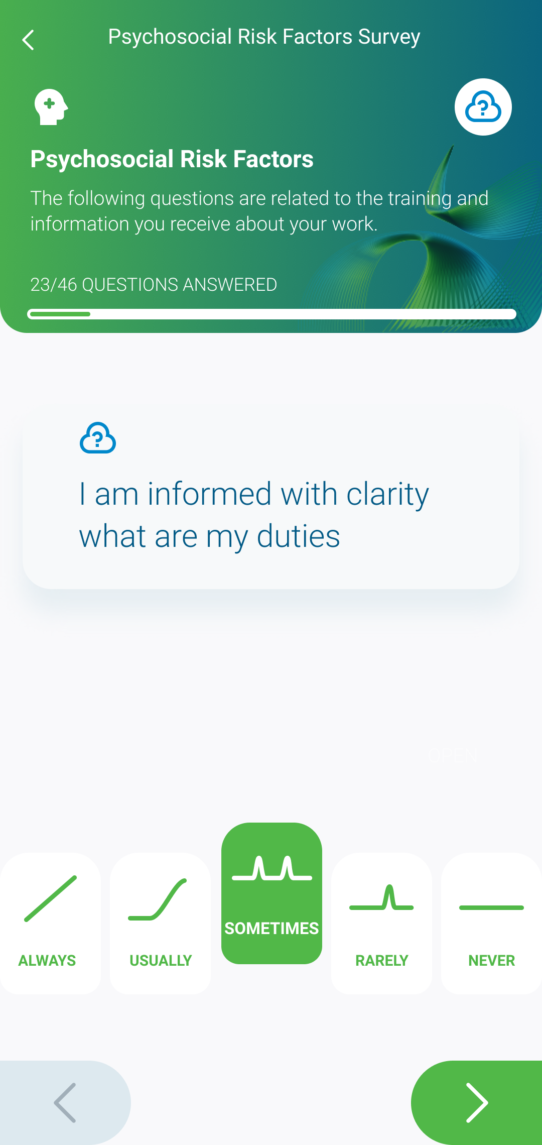
Interface Design: The interface design phase focused on creating a visually appealing and intuitive platform. Bold color palettes, intuitive navigation, and thoughtful placement of elements contributed to an engaging and user-friendly interface.
Once I tested out all usability mistakes, I started refining the final Interface Design in Figma.
I followed a calm yet inviting style with soft blue shadows, round corners, clean contrasts and bold call-to actions to create an enjoyable environment for user's brain by having all sense receptors like texture, depth, light activated.
This design approach will help the user to immerse in the experience and keep a positive feeling that will encourage mental wellbeing.
During this process I focussed to ethically design every pixel by applying the latest techniques in Human-Technology Interaction in a manner that will not harm human mental processes like attention, cognitive load or decision making.
I avoided common UX patterns that triggers brain responses that the user don't ask for, and I designed an Interface that the users brain can easily understand and use at free will.
Look and Feel: The visual identity of Omaisha was meticulously curated to evoke a sense of calm and professionalism. The look and feel were designed to resonate with the target audience, promoting a positive association with mental health.
As a product that is aiming to take care of mental well-being in the workspace, the interface look and feel play a major role in accomplishing this goal.
By using Brain Science in Interface Design techniques I designed a style that follows the natural environment we interact with, using shadows, textures, gradients, light, depth, and color that will make any interaction to feel real and calm.
The components that the user can interact with have both a dark and a light shadow creating depth, the brain instantly recognising this visual pattern from real-world scenarios where he can press a button.
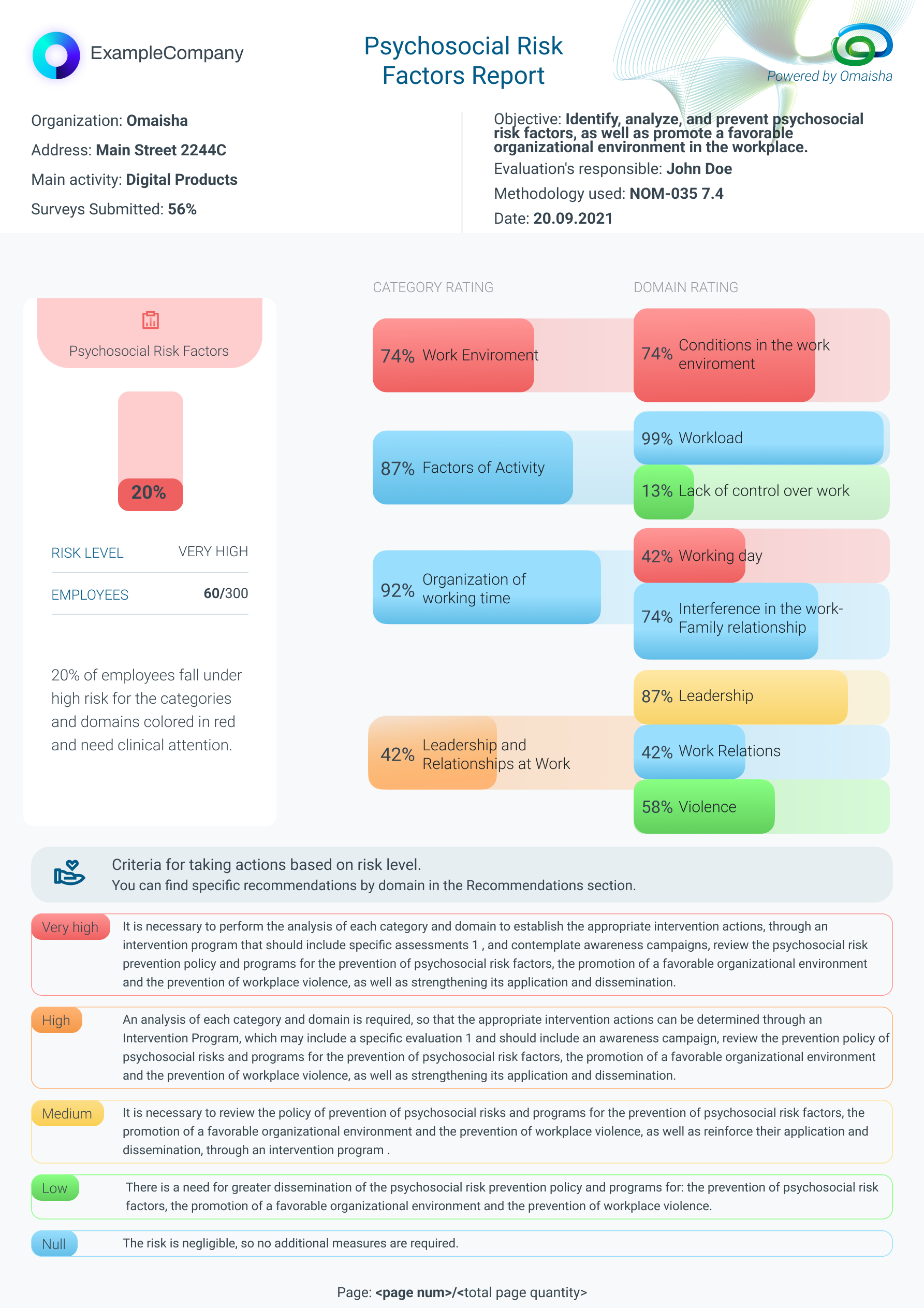
Components: Building a cohesive design language involved creating reusable components. Buttons, cards, and form elements were standardized, promoting consistency across the platform and expediting the development process.
The Design Components were used in the downloadable PFD Report design, allowing to have a unified visual experience for the user even offline while the reports will be downloaded and used for audits or internal use.
The feedback we got from users is that they are having the same experience when working on the platform and also with the reports they print from it.
The Ministry of Labour from Mexico mentioned that this is the best-looking report they have seen and used in this industry.
User Testing: Real user feedback shaped Omaisha's design. Users participated in testing prototypes, providing insights that directly influenced refinements. This iterative approach ensured the platform resonated with its end users.
The testing was conducted remotely, unmoderated with each subject having the task to complete their goal.
All users completed the task, for 75% of them the flow was clear, to 25% the back navigation button was unclear or hard to see and made the experience confusing.
I used the feedback to re-design the back navigation icon filled rather than outlined.
Another round of internal testing was performed using AI to scan hotspots on the screen.
Design Management: Leading a design team of three, effective design management was pivotal. Regular collaboration, feedback sessions, and fostering a culture of open communication were key elements in ensuring a cohesive and efficient design process.
Business Requirements and Goals: Aligning design decisions with business objectives was essential. From improving employee satisfaction to reducing workplace accidents, Omaisha's design directly addressed the overarching goals and requirements of the organization.
Jobs to Be Done: Understanding the fundamental jobs Omaisha needed to accomplish for its users guided design decisions. Whether it was simplifying survey creation for HR managers or providing actionable recommendations for employees, each design element served a specific purpose.
I mapped out crucial steps to be made in the Design Department which helped me discover the solutions to our goals.
The Design tasks created in Jira for the Design System Building Processes, User Journey, Wireframing, Prototypes, and improvements were organized in weekly sprints and the Design Team workflow was coordinated with the Product Management and Development Teams through Jira Automation, Agile Methodologies, and weekly standups.
Design System: A robust design system became the foundation for Omaisha's visual identity. From typography and color schemes to iconography, the design system ensured a consistent and polished look across the entire platform.
The Design System was built with Atomic methodology, containing all design elements used in the product, from Colors and shadows to components and pages.
With the advantage of starting the design process with High Fidelity wireframes I was able to scale the Design System at the same pace with the Interface design, having both ready for Development handoff at the same time.
To have a better Design-Development workflow, implementation, and collaboration I decided to link the Figma Design system to Developers Codebase trough Supernova.io. With this method any style change I made in Figma to the Design System automatically change the code, allowing us to save iteration time, to avoid bugs and to speed the development of new features.
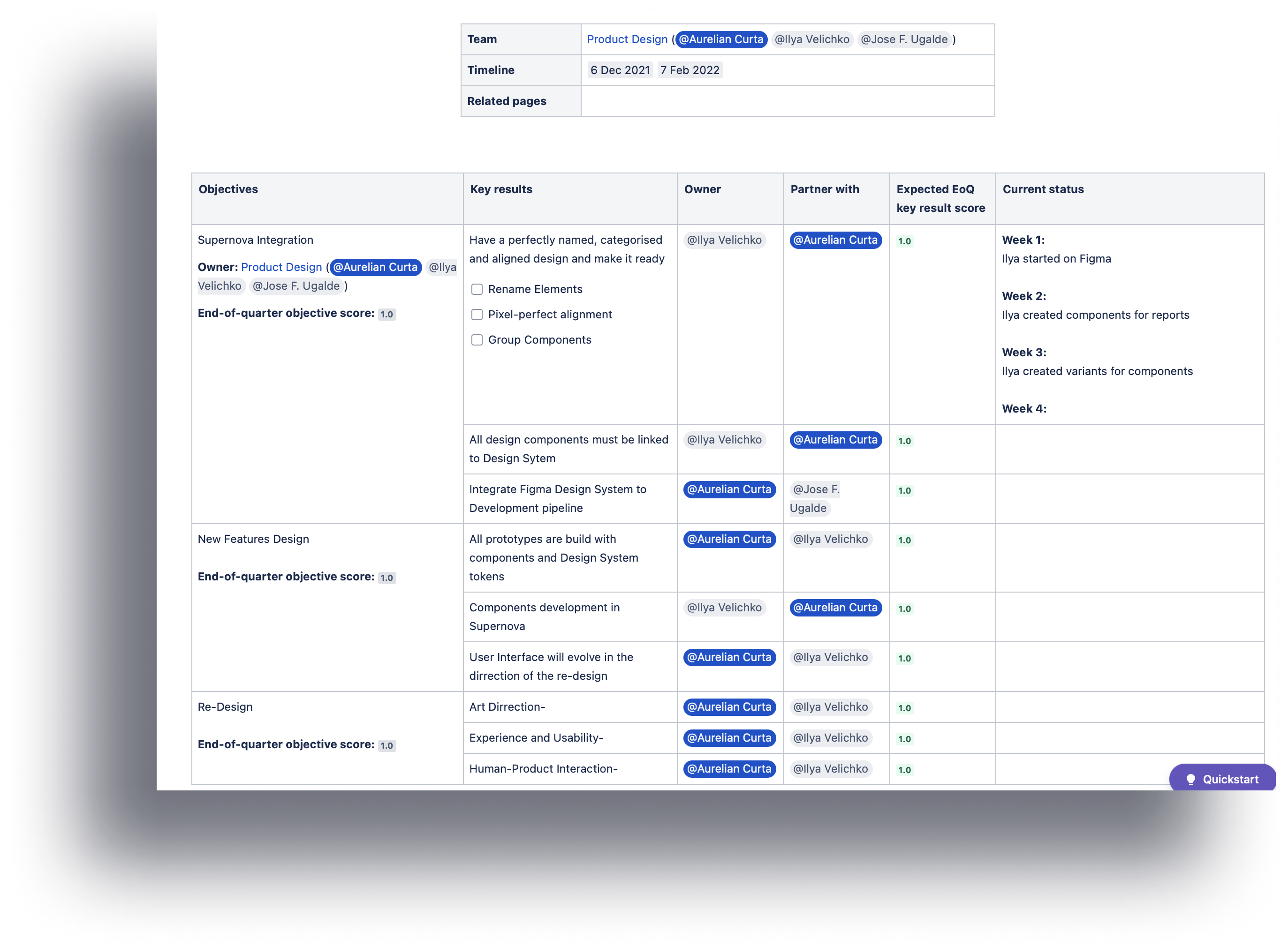
OKRs: Setting clear objectives and key results guided the design team. From improving user engagement metrics to enhancing survey completion rates, OKRs provided a measurable framework for evaluating the success of Omaisha's design.
To manage the Design Team and plan our process I used Objective and Key Results methodology in Jira, so all team can check the progress and our curent objective.
It helped us stay in line with our tasks in a fast-paced environment, having clear responsibilities and direction we managed to obtain results faster than planned.
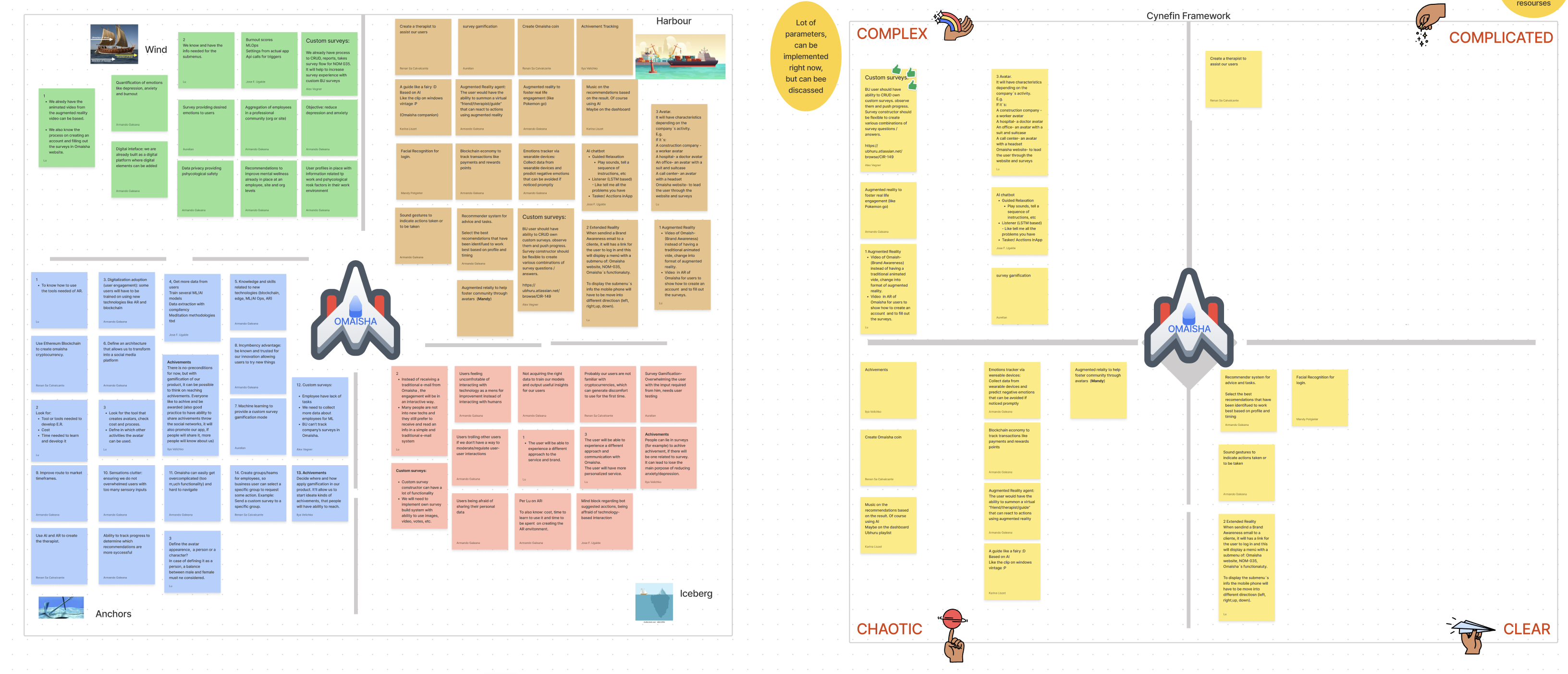
Card Sorting: Card sorting exercises aided in refining the platform's information architecture. Understanding how users categorized and prioritized information informed the layout and organization of content, enhancing the overall usability.
One of the card sorting techniques I conducted was Problem Prioritisation so as a team we can decide which project should we tackle next? Which opportunity should we run our next sprint on? How do we involve the team when prioritizing but avoid bias and groupthink? Radical prioritization facilitates alignment, a unified vision about opportunities that will create business impact and customer value.
Design Leading and Mentoring: Leading and mentoring the design team was a continuous process. Nurturing talent, fostering a collaborative environment, and providing guidance ensured that each team member contributed effectively to Omaisha's design excellence.
Led the Design - Development workflow by having weekly meetings with the Development Team involving them in the early stages of design to make sure we design what our developers can build in time for release dates.
Mentored an aspiring junior UX Designer on how to build and maintain a Design System, and apply correctly the Styles and Design Direction of the product. He was promoted to a Medium-level Product Designer.
Omaisha successfully launched in Mexico, appeared in multiple news platforms and television and is gaining traction while collecting feedback for future features from curent happy customers.
It was a fun and very interesting project for me to work on, in 13 months I had the opportunity to make a difference in people lives with a talented team.
The biggest challenges I encountered were managing Design-Development workflow and collaboration between globally distributed teams, I overcome them by automating the Design System-Development handoff, documenting the Design System and regular meetings with Development Lead.
I had to learn how to design printable PDF's with adaptive layouts, television interview backgrounds, After Effects Illustration Animations, I mentored a junior Designer, so I wore all Design hats, and some awesome new ones also!